2026
Café de' Mercanti
Concept redesign of an Old Montreal café website. Hand-built UI and UX in plain HTML, CSS and JS
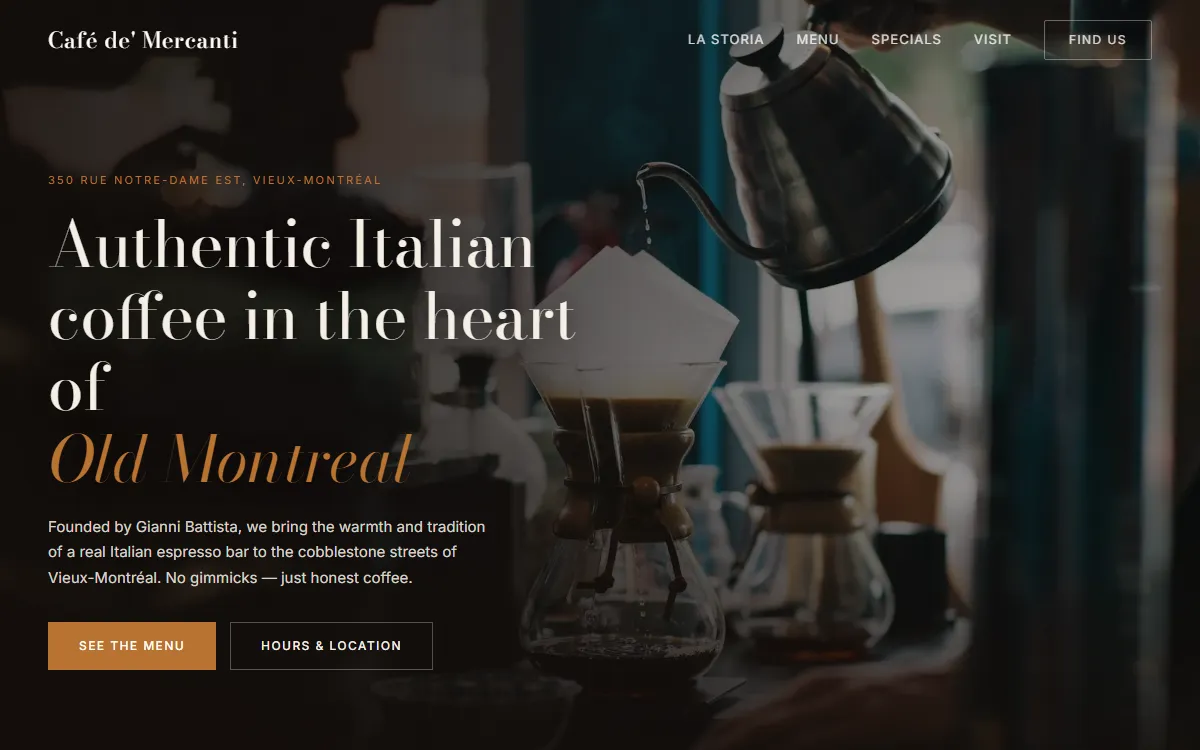
A UI and UX exercise: a one-page website for an Italian espresso bar in Old Montreal, designed and built by hand in plain HTML, CSS and JavaScript. It is an unofficial concept, not the café's own site.
What's in it
- A full-bleed hero with the address line and two clear calls to action.
- The menu as a slider: four tabs, dots, swipe on touch, and auto-advance that pauses while you hover.
- Specials as image cards, a photo gallery, and a quote divider with a light parallax.
- Opening hours that highlight today by themselves, next to an embedded map.
- A burger menu on phones, a nav bar that pins after you scroll, and sections that fade in as they arrive.
Design
Bodoni Moda for headings, Inter for text, and a coffee palette: espresso, crema, parchment and a copper accent.
What I'd do differently
Plan for contrast from the start. White type looked fine on the first hero photo and became hard to read on a busier one, so the overlay now darkens the side the text sits on rather than only the bottom. Hotlinked photos also disappeared over time; every image is now stored with the site.